For All Mankind / Network Branding Elements
For this SCAD Network Branding project, I took on the challenge of rebranding and creating a title sequence for Apple TV+'s 'For All Mankind.'
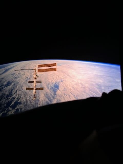
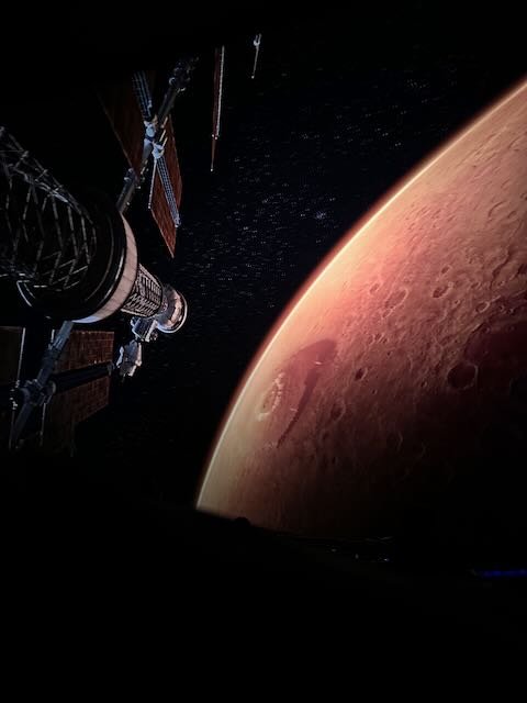
Inspired by the show's alternate history of a Russian space race victory, my concept blends retro futurism with a forward-looking perspective. The title sequence traces the historical trajectory of space exploration and injects a sense of wonder into a future yet to unfold.
Specifically, the brand elements I worked on were:
Main Title Sequence
Episode Title Cards
Previous Season Recap
YouTube :30 Promo
Out of Home Advertising
Apple TV Thumbnails
EPISODE TITLE CARDS
TITLE SEQUENCE
OUT OF HOME MARKETING
APPLE TV THUMBNAILS
SOCIAL PROMO
SEASON RECAP
PROCESS
RESEARCH & CONCEPTS
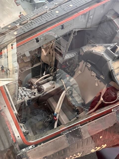
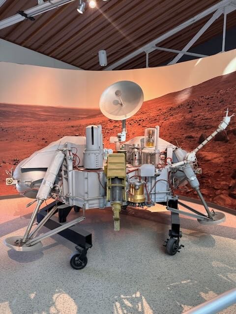
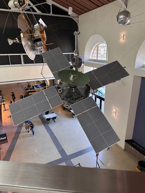
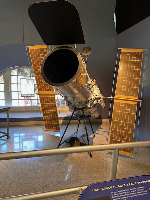
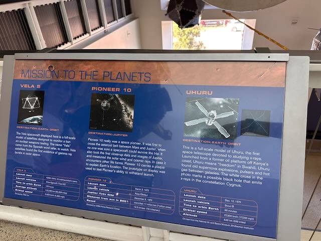
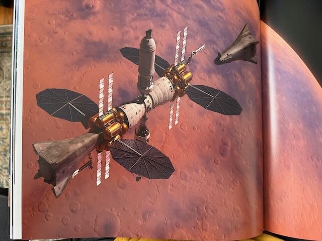
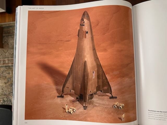
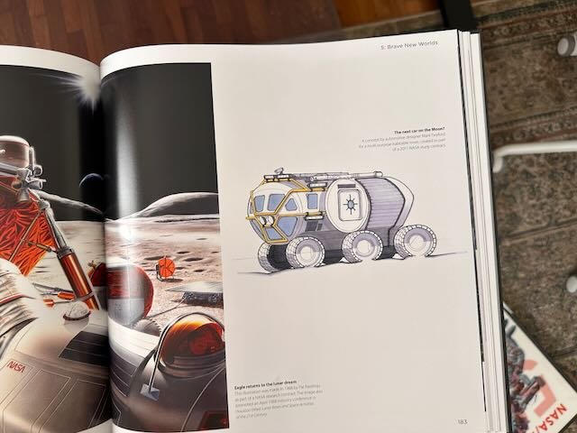
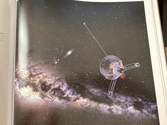
To research the topic of space exploration and get a better sense of my subject matter, I took a trip to the California Science Center in Los Angeles. Seeing the technology of the original space program inspired me to explore a retro futuristic approach to the branding design language.
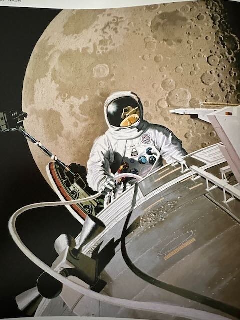
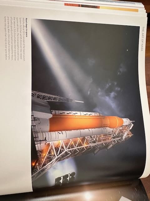
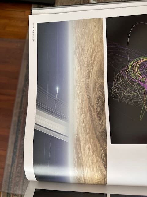
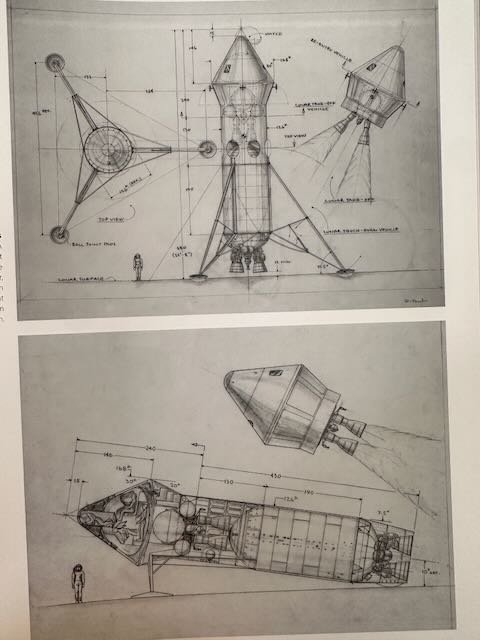
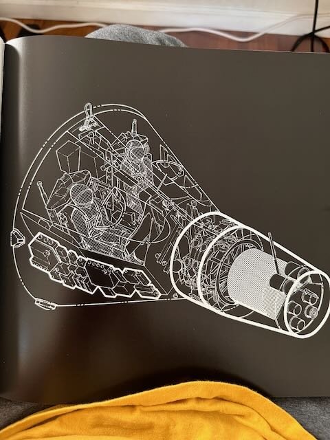
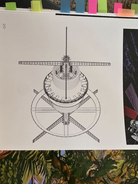
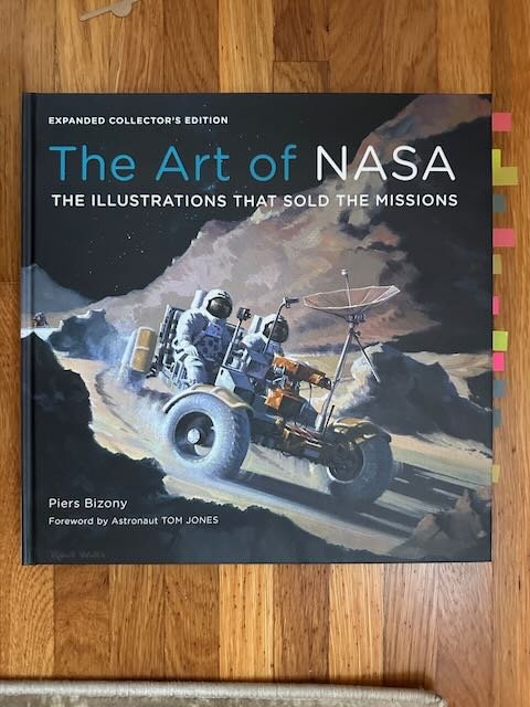
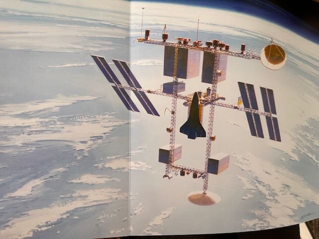
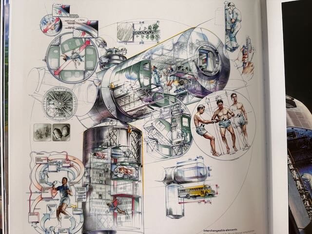
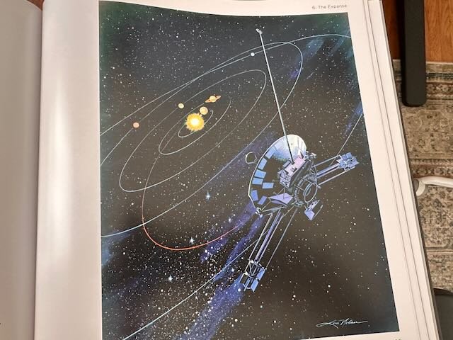
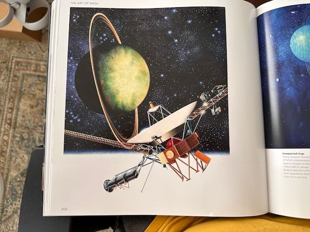
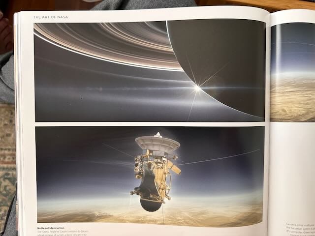
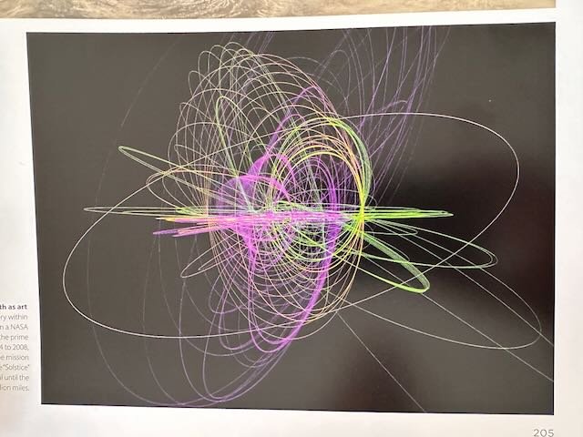
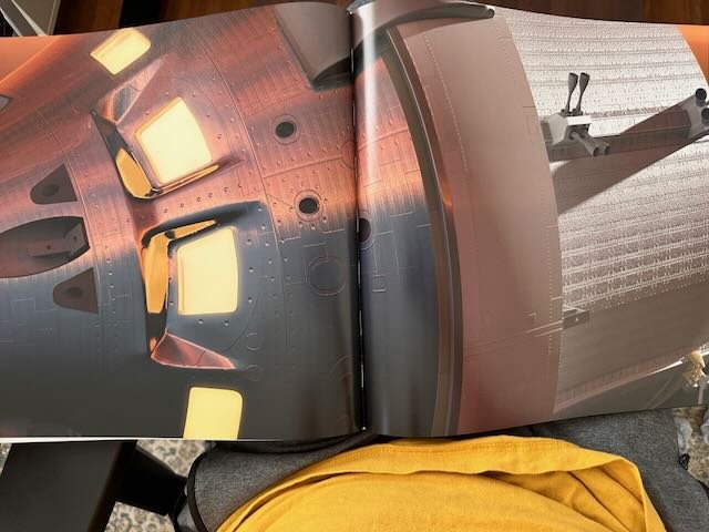
I also purchased some books of historical NASA concept art which helped me take the concept even further.
WORD LIST
Nasa
Space
History
Alternate History
Future
Exploration
The Unkown
Failure
Strength
Perseverance
Technical Documents
Orbit
Timelines
Threads
Planning
Looking Ahead
Engineering
CONCEPT 1
Technical Diagrams and Embroidered Patches
FINAL CONCEPT
INITIAL STYLEFRAMES
STORYBOARDS & ANIMATIC
CONCEPT 2
A Journey Across the Solar System
Mid Century Design Mixed With 3D Scenes and Technical Overlays
The problem with each of the previous three concepts was that none of them felt complete. The goal is not only to create a great title sequence, but a design language that can transfer to other branding elements.
But going through these different design directions helped me land on the final concept, a mix of mid century design with 3D scenes and technical overlays.
The technical overlays and paper textures give a vintage, tactile feel to what would otherwise be a clean, digital scene.
CONCEPT 3
Space Travel Posters
TITLE CARD ITERATIONS
Of this entire process, the title cards were the most challenging. It was a constant battle of creating something simple enough to not distract, but also be different from the current title card which is just the title against a black background, all while staying true to the design direction that was created through the other elements.
In the end I scaled back as much as possible to end up with a subtle balance of simplicity, legibility, and visual interest.
During the animation phase, a few of the planned moments just weren’t working, but the storyboards gave me a solid structure to work with. Having the storyboards as a foundation made it easier to make adjustments on the fly.


